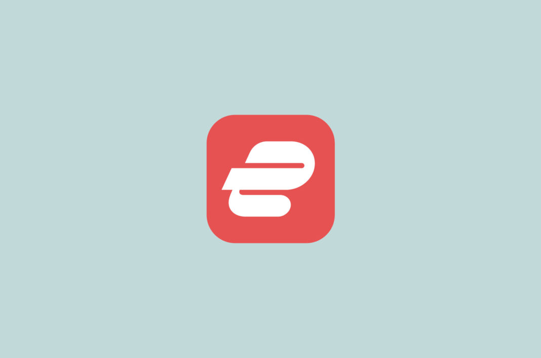
We’ve paid close attention to your feedback on our new app icon and are making a change. We know for years you have associated our app with the red color, so we decided to bring back the red background to make the app easier to find. The updated icon is coming soon to your apps.
We introduced the new logo as part of ExpressVPN’s new look. The revamped logo is a lowercase “e” in our new signature red. Its fluid lines convey speed and motion, reflecting our constant drive to deliver more—and more cutting-edge—privacy and security tools and technology to you.
The redesign is part of a new era for ExpressVPN, in which we’re launching an upgraded VPN experience with our groundbreaking VPN protocol, Lightway; our research center Digital Security Lab; and new functionality in our apps, including Protection Summary.
In the coming months, we will be introducing more ways to increase your online privacy and security—beyond using a VPN. But first, keep an eye out for our new logo, and let us know what you think in the comments!


Comments
👋 👋 👋 👋 👋 👋 👋 👋
Also, the new program logo without the red background is really distinctive, beautiful and modern
Don’t like or understand your new logo, but I like your service. So, I guess I will adjust to your new logo.
I didn’t realised there was a way to provide feedback until you mentioned changing the color back. When you first changed it I really didn’t like it and I’m not sure why you changed the logo. The old one was great. Now… I still think the new logo looks like poop compared to the old, but at least this is partly fixed. I’m also not sure why you would even want to change the logo as the old one was so smart with the E and the V together and the E looking like racing lines on the V.
The new logo looks like a reverse of the Parler logo. I prefer your old, more distinctive look.
Please do not change the icon I like the current design
I, Ali Sami Farooq think that we should have a concern that VPN works properly and have more IPs of missing places (like Dubai) in its database. But my views are that the previous one was much better than the present one.
~Ali Sami Farooq
Personally, I don’t care whether the icon has a background or not.
I was going to write a comment quite similar to yours, but I saw yours before I did. I agree with you 100%. While I haven’t had any experience with other VPN providers, I am very happy with the service ExpressVPN has provided me. As long as I can discern its icon from others in my system tray and start menu, I couldn’t care less what it looks like.
I would like to add, though, that using a lowercase “e” for the new logo seems odd. While the logo’s lean to the right does convey a feeling of speed, the rounded corners give me the feeling of softness and compromise, neither of which are attributes that I want my VPN service to have. The fact that it is a lowercase instead of an uppercase used says something as well. Uppercase letters are used when an entity (an individual, company, etc.) wants to convey they are serious about something, such as “NO!”, “BEWARE OF DOG”, “50% OFF SALE”. As for the color…. Well, red is the color of danger. It also means “Stop” when used in traffic. Red is used to draw attention or caution. Dark blue might have been a better choice. It is used to calm people and make them feel secure.
In any case, I think you’re giving too much credence to graphic design. If your product stops performing like it should, you’ll see just how little loyalty the pretty interface and icons earns from your customers.
Why so much trouble? A new picture & new color are ok for (big) new upgrade of an old software. I have no trouble with that :^)
Personally, I prefer the new green colour for the icon. It feels fresh and like a new start.
This is what I like about this company. They actually care about what their customers think/say.
This new icon looks great without the red background! Please keep it! Or at least give us the option to choose in the settings.
Also, a dark mode option in the app would be great!
As long as ExpressVPN is keeping us safe does it really matter what the icon looks like? It’s nice to have a change from time to time but then again we are creatures of habit right? Basically I’m new to ExpressVPN and I’m also shocked how efficient it is. I’ve came over from CyberGhost after one year, and let’s just say I wasn’t a fan but have been blown away by ExpressVPN. You’re probably wondering why I’m telling you this? Well basically believe me, ExpressVPN icon should be the last thing for you to worry about. Keep us safe is the main objective.
new logo does not make any sense
I don’t care if the logo looks like a man being buggered by a biker gang, as long as the security works!…
Express VPN protects my privacy and that’s what counts in my book. I like the fact that you are updating your operations and keeping us ahead of the game. Well done!
Been an Express VPN subscriber for a couple of years now. Has worked great every time. The one time I did have to call CS, they were prompt and spot on! I have every faith in Express VPN. Having said that, I don’t see any reason to have changed the icon and the screens. The old icon looks great. The green screens were well defined and looked good. The new icon adds nothing to the quality of the product (app) and the colors of the app pages are drab and dull. The old red and black images on white backgrounded screens looked fine to me. However, if they want to have pink elephants dancing thru the tulips on the “back 40” at Rebecca of Sunnybrook Farms place, that’s fine with me as long as the app works great and performs as advertised!
The old logo felt stronger but can’t explain why. As long as the product and customer service remains excellent I’ll get used to it.
I do not like the new look like they all look better this one looks too ….You know what
ExpressVPN has been solid so far, and I am looking forward to see what changes can help keep us secure.
I am going to have some faith here as with all new products, as ExpressVPN is a trustworthy brand.
I liked the old logo but the new one is equally great. I’m currently living in that part of world where the vpn isn’t a luxury but necessary tool. I want to say a big thank you to ExpressVPN ..their vpn service kept me connected to family and friends (& work) in the UK.
…Thankyou for the great service …
will you be able to put passwords in catagories instead of a list
I’m more interested in functionality than design – form follows function and all that.
That said,the apps for Windows and Android seem to work very well – especially in a country that censors the internet. The new colour scheme and ripple,especially the orange/red when not connected, is reminiscent of the colours used for the “Looney Tunes” cartoons of Warner Brothers.
Shocking time and effort is being spent on a logo when you have non existent “live” help and custom service. Using Covid as an alibi! Really remote jobs are impacted by Covid? I won’t be renewing going elsewhere where there is an actual person you can talk to.
Our live-chat support has been back to 24/7 operation for quite some time now. Support team members working from home can have an impact on our users’ privacy, which is our No. 1 priority. We suspended 24-hour live chat for about one month last year to mitigate any risks.
Any chance of a dark mode option within the app?
I don’t care for the new logo at all. It looks like the ESPN app logo. The new color scheme looks cartoonish, making the app look cheap and unprofessional. A better design would be a stylized EVPN perhaps slanted to the right to suggest speed and motion.
all this means only one thing they are going to raise there rates, they charge to much as it is
Don’t like the new look at all. No significant changes to the user interface, so why change the look at all? Change for the sake of change?
Functional improvements are good.
Love everything about Express, trust them keeping me safe. Would like to see a server in Key West, how can you not. A piece of land surrounded by water, not Hawaii, in the USA and warm year round: Key West, FL !!! We need one there ASAP !
Sometimes you change just for the sake of change.
You go ExpressVPN!
Kick ass and take names.
And thanks for your excellent service.
After such a long time that Lightway announced back to May 2020, still to TCP for it, it only has UDP.
Will TCP also be implemented for the Lightway, in ExpressVPN for Windows? Thank you.
If you want faster Internet – UDP is a way to go. If you want more accountability (error checking) and don’t care as much about speed then TCP is what you need.
I am very satisfied with the new logo since I am new and don’t know what the old one looked like.
How could I cancel.
I don’t think I need this.
I don’t even know what it represents.
To cancel, please get in touch with Support via live chat or email.
You are projecting ‘lightway’. I want my VPN to be ‘TOUGHWAY’. – Explain.
Hello!
I’m a beta user and i had the opportunity to see the new look and logo in the Android app and i think it’s great! I like a lot the new feature “protection summary” and in general the new changes. I would like to suggest something, that i think it will make the user experience even better: Is it possible to be included an ad blocker witch will block ads in browser and in apps? I don’t know how difficult it is or if it will cause a security problems, but if it’s possible is something i would like to use.
Thank you for the great service.
Have a nice day!
Iakos
I’m trying to download the express vpn app on to my macOS and I can’t even find it in the App Store. I’ve already downloaded the app (red/white) on my iPhone. What should I do next to get this VPN service on all my devices and router?
Hi Paula, please refer to our Mac OS setup tutorial: https://www.expressvpn.com/support/vpn-setup/app-for-mac-os-x/
Alternatively, contact Support by live chat or email for help.
Hi Penny, when the new apps with the new logo will be out?
I really like ExpressVPN . It has been very reliable for me & since I have been using it with Lightway & AES it has been quicker than before . I’m impressed . Keep up the good work .
I’m sure it will break somebody’s heart and spirit, which would never be my intention, but I think the old logo with the overlaid white letters is not as ‘fancy’, but is MUCH clearer as to what the underlying program is. There are numerous red ‘blob’ logos and the tray icon is the especially most difficult area to tell what the new icon connects to. There doesn’t seem to be any reference in the design to any ‘function’ like connectivity, or separation/security. It is just a stylish red swirl to me.
It is not unpleasant, and certainly could be a nice corporate logo, but I don’t find it nearly as useful for me, with admittedly aging eyesight.
I am looking currently at my screen with the Firefox Add-on EV on Red logo and it is quite easy to pick out from LastPass and several other red icons.
Not so in the system tray with the new EVExpress logo.
I know ‘feature creep’ is almost as incidious as Coronavirus, but could you give the Option to have a choice of logo for visual Accessibility with the high contrast EV over Red icons?
You are doing a GREAT job, so please tke my criticisms of this one item in context and perspective.
Thanks,
Robert L. Huber , aging SF Bay Area IT consultant, currently in New Zealand.
So in other words, you hired a new marketing firm that is desperately trying to prove themselves to you?
Good luck with that.
I totally agree with you. Always somebody has to make something “better”, just for the sake of “earning” the check. Just think of all those “enhancements” since Win 3.1, and do any of you on here type any faster or think any more clearly as a result? And how about all the aggravation every time a new roll-out came around, trying to migrate the old into the new while learning where the “format keys” you learned so well are now relocated “for your added convenience” of course. Putting lipstick on a pig doesn’t make it a pony. But, Hey, that’s just an ole geezer speak’n, and you all know they don’t know squat…
Just like the government, always meddling, always screwing things up. The old logo was way better than this new one. As Robert Huber above stated…”old logo with the overlaid white letters is not as ‘fancy’, but is MUCH clearer as to what the underlying program is. There are numerous red ‘blob’ logos and the tray icon is the especially most difficult area to tell what the new icon connects to. There doesn’t seem to be any reference in the design to any ‘function’ like connectivity, or separation/security. It is just a stylish red swirl to me.
It is not unpleasant, and certainly could be a nice corporate logo, but I don’t find it nearly as useful for me,” The new logo represents bloat, fat and slow…ExpressVPN needs to spend more time increasing their throughput speed rather than creating a a new logo that does nothing for their service and won’t generate one more subscriber for them vs the old logo.
Love your service. Don’t love the new logo.
Here is what I see as wrong:
1. The top-heavy curve doesn’t signify speed. It is more reminiscent of a Beluga nose
2. Color is a dull share of red like it has lost all energy and is anaemic
3. Having a Slanted end on the left side is a disconnect
The current logo is better over the new one.
I totally agree…The new logo, regardless of the background sucks!
Please keep your current logo. It is much more classier than the redesigned logo. The new logo looks too generic and simply BLAH.
I much prefer the current logo also. Please please re consider. Current logo wins hands down.
I prefer the current logo as well. It signified speed and was eye catching and something you would remember. The new logo is just plain blah and unmemorable so I wouldn’t recognize it if I saw it anywhere else 5 minutes from now.
I think your current icon is much classier. Please keep it.
I love ExpressVPN and recommend it to all of my friends/family when talking about international travel and general privacy at public hotspots.
Therefore, I want to be a friend who tells their other friend the truth… that what they’re wearing does not look flattering.
Not that I loved the old logo (I’m all for rebranding, especially given the exciting new Lightway protocol), but I’d seriously consider going back to the graphic design team and looking at a few more options. I barely see a lowercase E and I don’t see “speed” at all communicated in this new logo. Also, the new red/salmon color doesn’t help either… overall it looks like just another food delivery service app.
Please reconsider before pushing this new logo to all of your apps and website. :-/
I tried the new re-design on the Windows beta and I have to say – I do not like it at all. The current logo and app design is polished, simplistic, refined and sauve. The new one looks like a cheap imitation of the old one. Kindly include an option to revert to the old skin. Thank you!
thkyu so much